Website Conversion — Fix the Leaks & Increase Leads!
Share this story
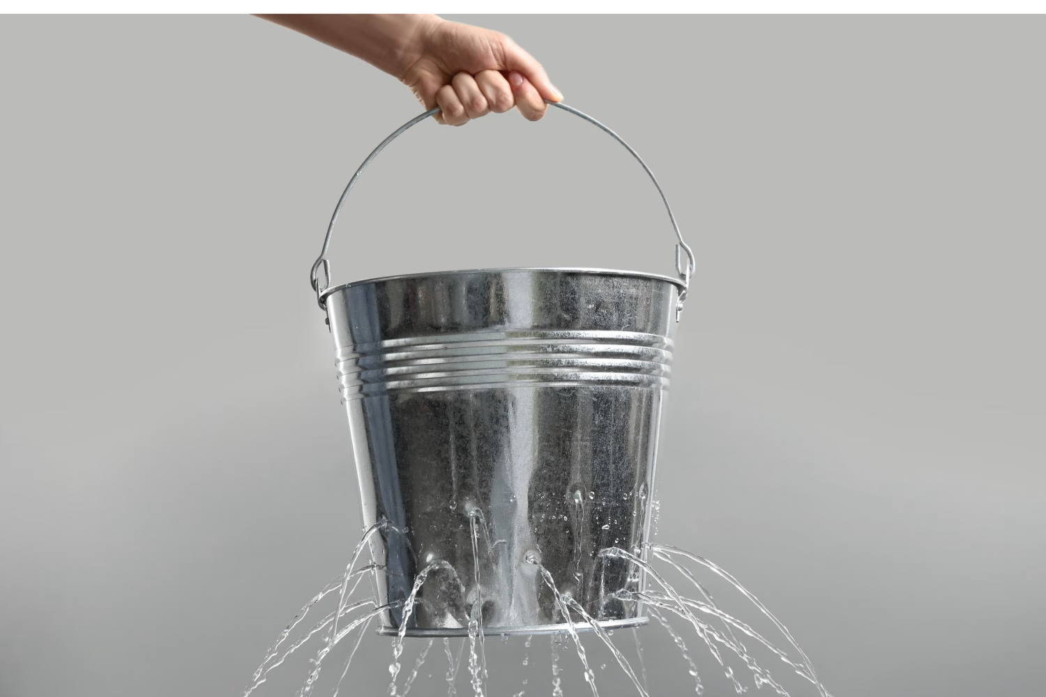
Marketers may see a low number of leads coming from their website and immediately think, “I have to drive more traffic to my site!” But if you’re already investing in email marketing and social media, and you’re appearing more relevant in organic search results, what else is there to do? Often, the issue isn’t that you aren’t driving enough traffic to your website, it’s that your site is “leaking.” It could be that the best way to increase your leads is to stop driving your current visitors away!
Focusing on your website conversion strategy is critical to delivering qualified leads — and ultimately sales — to your business. But conversion is about more than just asking people to fill out a form on different types of content. Ask yourself these questions to help find and plug the holes so you can improve your website’s conversion rate:
1. Where and why are people dropping off?
Is your homepage a turn-off? Is your offer clear? Does your target audience find your navigation confusing? These are all key questions to ask, and with tools like Google Analytics and a website testing program, you can find the answers.
2. Are your forms turning people away?
Do you have a long form page with a lot of questions? Do you know what percentage of your users fill out part of the form and quit — or, even worse, don’t start? Are you making clear to your visitors what they’re going to get by filling out your form? Analyze your form page’s performance. You may find you’re making things tougher for users than they need to be.
3. Do you have content that will drive interest in your product or service?
Do you have ebooks, blogs, infographics, interactive tools and service copy that make it easy for visitors to determine what solution is the right one for them? Are you personalizing content to address persona pain points?
4. Are your conversion buttons and calls to action (CTAs) user-friendly?
They should be easily visible, action-oriented and placed near key spots in your content — as opposed to just at the top and bottom of your page. Test the language on your buttons and CTAs to make sure it’s resonating with users.
5. Are you offering conversion opportunities tailored for each part of the buyer’s journey?
Top-of-funnel visitors may not be ready for a call with your sales team. But if that’s the only conversion option you offer, you’ve lost the opportunity to continue the conversation. If a user came to your page from a search engine, are you helping them answer their questions? Could people be leaving because your only conversion options are better suited for buyers further down the journey?
6. Is your site user-friendly?
Make sure your site is designed for self-service. Do A/B and user testing to verify your navigation is clear to your target audience. Organize the information based on how they buy, not how you organize your business units or products internally. Ensure you’re speaking the customer’s language, and not using your own jargon. Visitors make a decision about a site’s usefulness in less than a second.
7. Does your homepage CLEARLY state what you do / sell?
You have less than a second to keep your visitors. Make sure you’re using valuable real estate on your website to deliver business value to your customers. That often means saying “no” to the impulse to rotate short-term promos or events at the top of your homepage. Instead, focus on the conversion elements that deliver quality leads.
8. Is your website fast and easy for everyone?
A slow site is a non-converting site. Ensure your site performs well across devices and browsers. Consider initial page load time, the use of performance-enhancing tools, accessibility and localization to make sure you’re delivering a great experience for all potential buyers.
9. Do you help users know what to expect?
Generic “contact us” forms with no info on a response time frame don’t encourage a visitor. Instead, communicate clearly about what the user will experience if they take the next step.
10. Are you using color strategically?
Research on color theory abounds and is worth considering to improve your web conversion. In fact, some data suggests that it takes a mere 90 seconds for a customer to form an opinion about a product and about 62–90 percent of the assessment is based on colors alone. What colors are you using on your website? Did you know that yellow in large doses can cause anxiety? How about that in strict testing environments, the highest-converting colors for calls to action are bright primary and secondary colors – red, green and orange?
We’re helping clients stop the leaks in their websites every day! Gain more insights on website conversion and optimization by subscribing to our blog below. Or, get in touch to find out how our team can help you!